Light, Shadow, and Recollecting Place: OAG’s Spanning the Divide
Distinct for each individual, a complex combination of subtleties make up a sense of home. Ottawa Art Gallery’s exhibition Spanning the Divide explored place through sensory experiences which bring with them the intangible: belonging, displacement, memory, and familiarity. Consisting of works by recent University of Ottawa Master of Fine Arts (MFA) graduates Heer Mandaliya, Kelly Rendek, and Sarah Tompkins, the exhibit explores how we interact with the places we inhabit.
I was taken by surprise to find that OAG’s Spanning the Divide is alive with light. Inanimate objects ripple, reflect, and glow with the movements of the visitor in the exhibition space. I found that each work’s interaction with their place and visitors brings forward one of the exhibit’s key ideas that settings are made intimate with our presence.
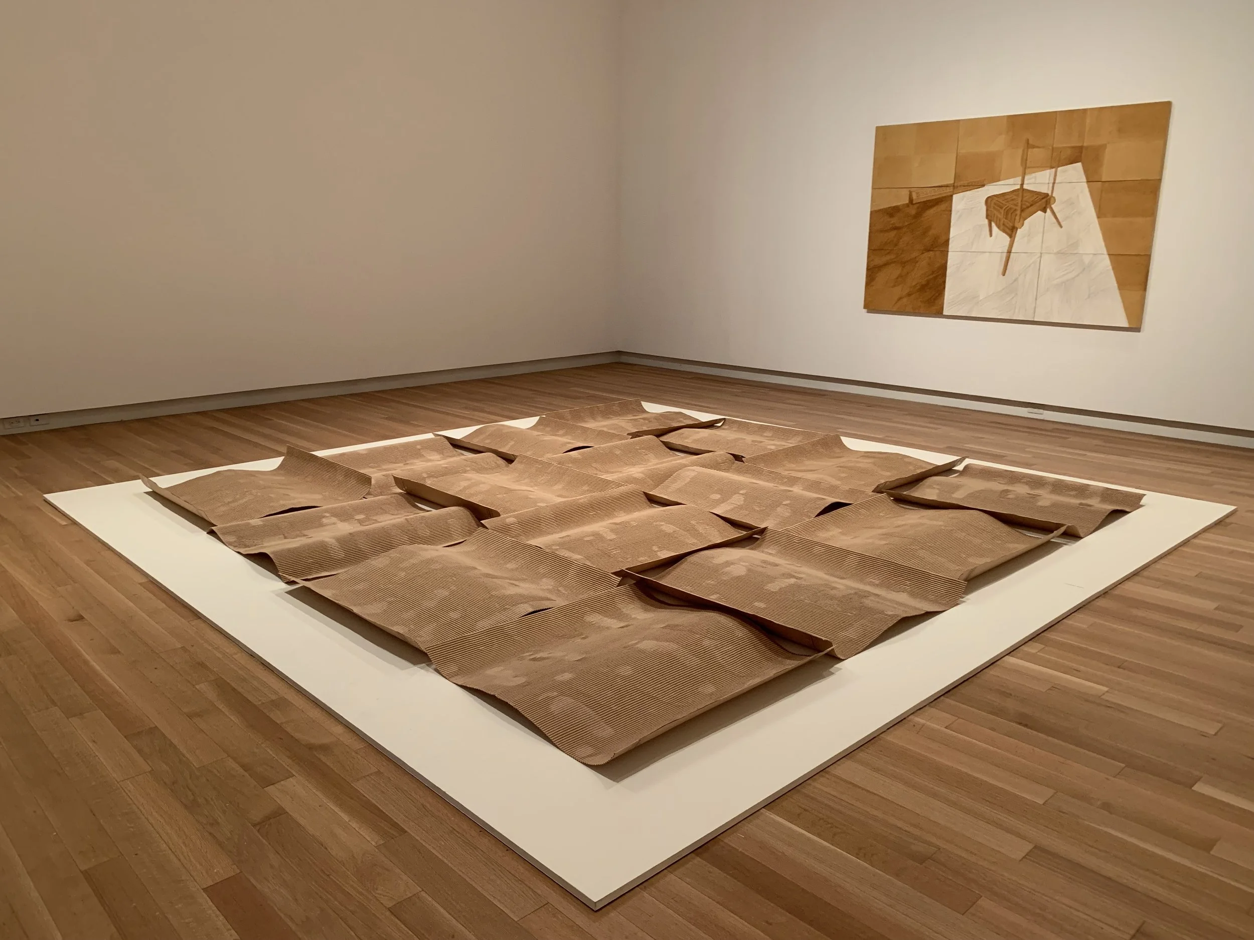
Mandaliya, Heer. The Boundaries Are Now Crossed, 2023, corrugated cardboard. Photo: Olivia Musselwhite.
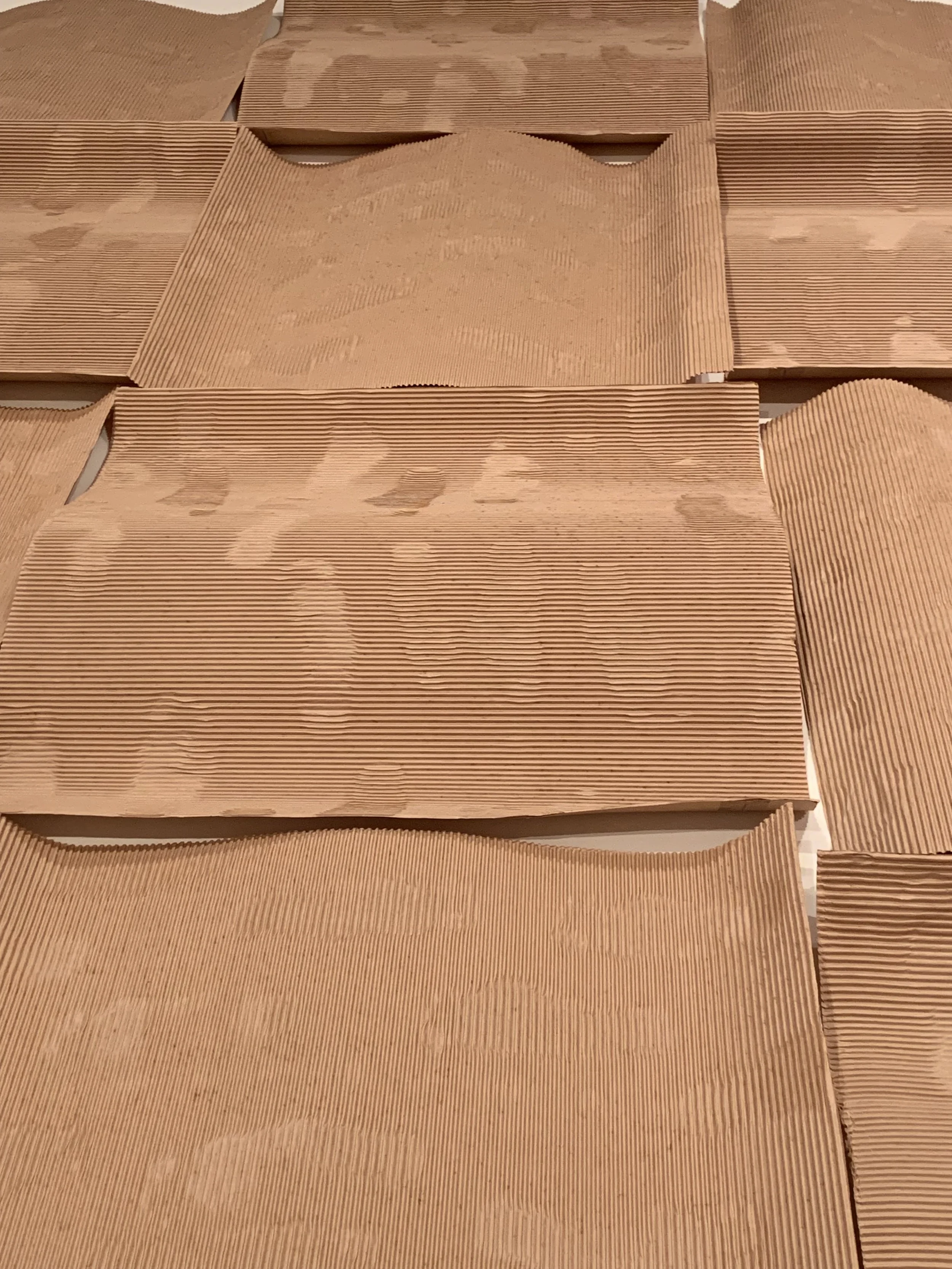
Opening the doors to the exhibition, Heer Mandaliya’s The Boundaries Are Now Crossed (2023) greets the visitor first. Wavy segments of corrugated cardboard ripple along the floor of the gallery. The interchanging direction of the ripples cast light and shadows and, as I walked around the work, this created the illusion of choppy waves transitioning with my own movement. To me, the imprints of footsteps on the cardboard seem to indicate that the boxes were once flat and stationary but now they are in transition.
Mandaliya, Heer. [Detail] The Boundaries Are Now Crossed, 2023, corrugated cardboard. Photo: Olivia Musselwhite.
Mandaliya’s reference to floors is a recurring theme in her work. The artist explores displacement, nostalgia, and the diasporic experience through interior spaces and floors, reflecting on her life as a South Asian artist living and working in Canada.
Mandaliya, Heer. With Turmeric on my Face And Chai in My Hands…, 2023, acrylic paint, alcohol markers, and modelling paste on wood panels. Courtesy of the artist.
The Boundaries Are Now Crossed is paired with Mandaliya’s With Turmeric on my Face and Chai in My Hands… (2023). The work depicts a lone chair in a sparse room with a heater. In Mandaliya’s work, her attention to overlooked textures of the everyday are evident, giving places the ability to bring forward memories.
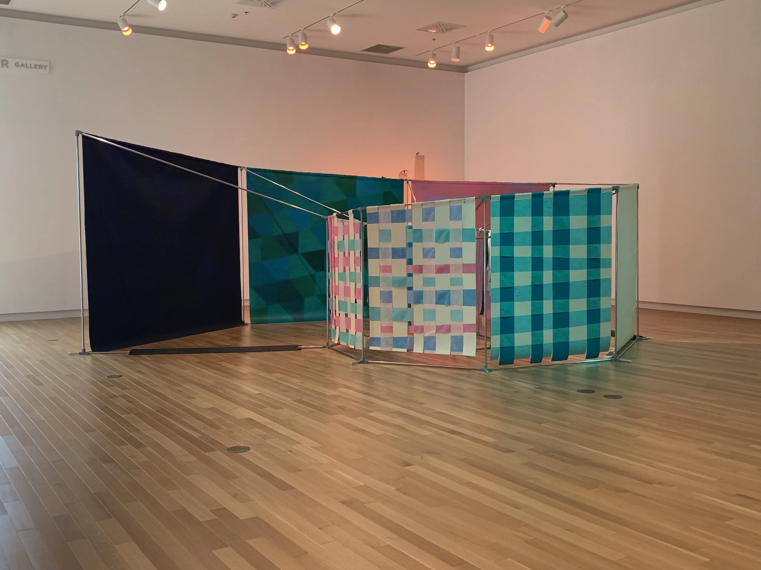
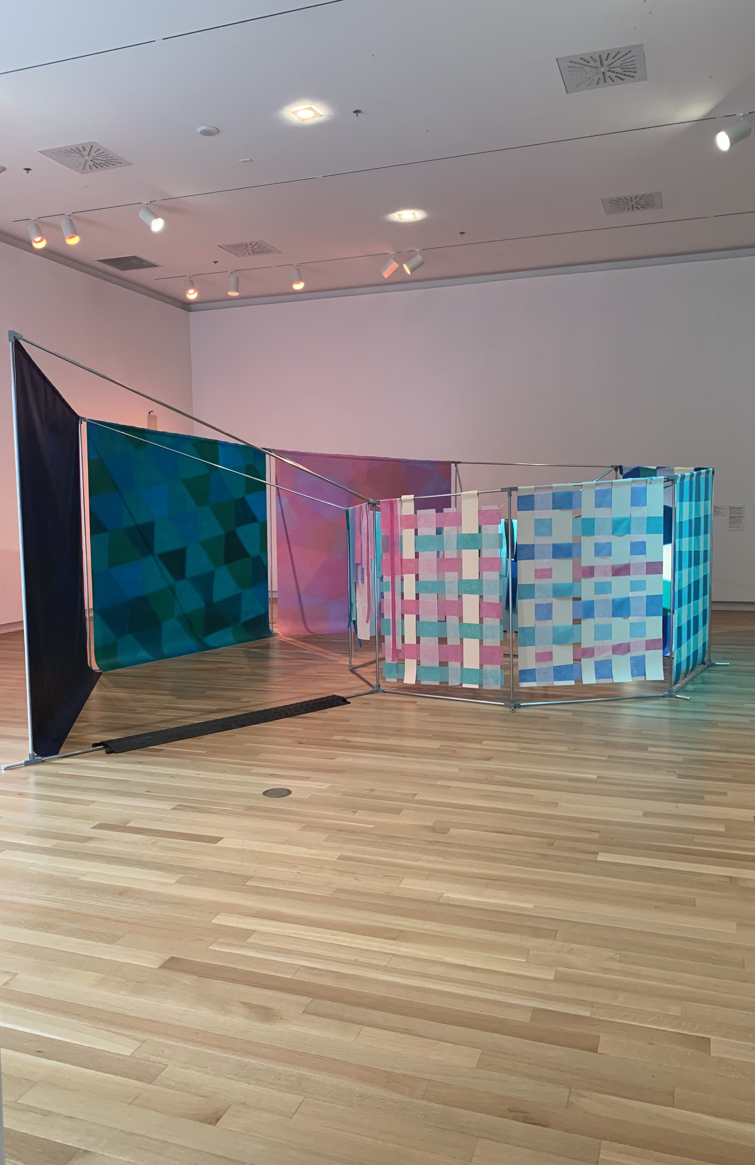
Rendek, Kelly. The Practice of Home, 2023, aluminum rounds and tubes, 3D-printed PLA, acrylic and oil on canvas, acrylic on spun polypropylene. Photo: Olivia Musselwhite.
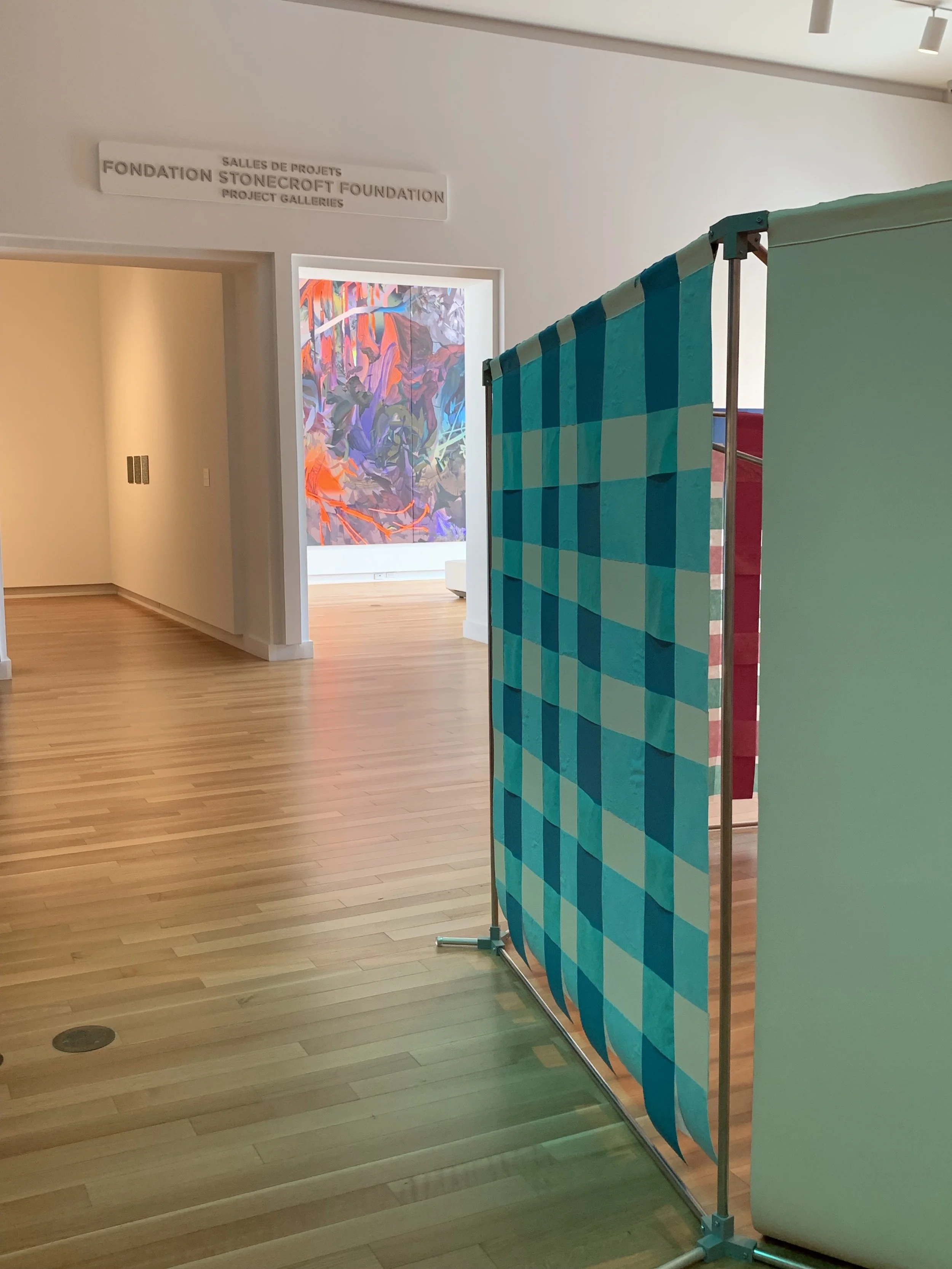
I immediately felt drawn to Kelly Rendek’s The Practice of Home (2023), a giant nautilus shell which curls into itself on the gallery’s floor. The form is held up by cascading metal rods which are lined with opaque and translucent streamers in shades of pink, blue, and white. For myself, these streamers, arranged in stripes and gingham patterns, were reminiscent of birthdays and picnics.
Rendek, Kelly. The Practice of Home, 2023, aluminum rounds and tubes, 3D-printed PLA, acrylic and oil on canvas, acrylic on spun polypropylene. Courtesy of the artist. Photo: Gina Dragone.
The exhibit label invited me to step inside the artwork to engage with the space. Stepping into the shell, I became enveloped by the interior. As I walked toward the center of the spiral, I curled into myself to fit under the rods and unfolded again at the epicenter. As I walked through the work, the light coming through the delicate streamers of the shell moved with me. Rendek’s work is dynamic and interactive. The artist’s careful attention to colour theory and geometric abstractions is evident as you move through the shell.
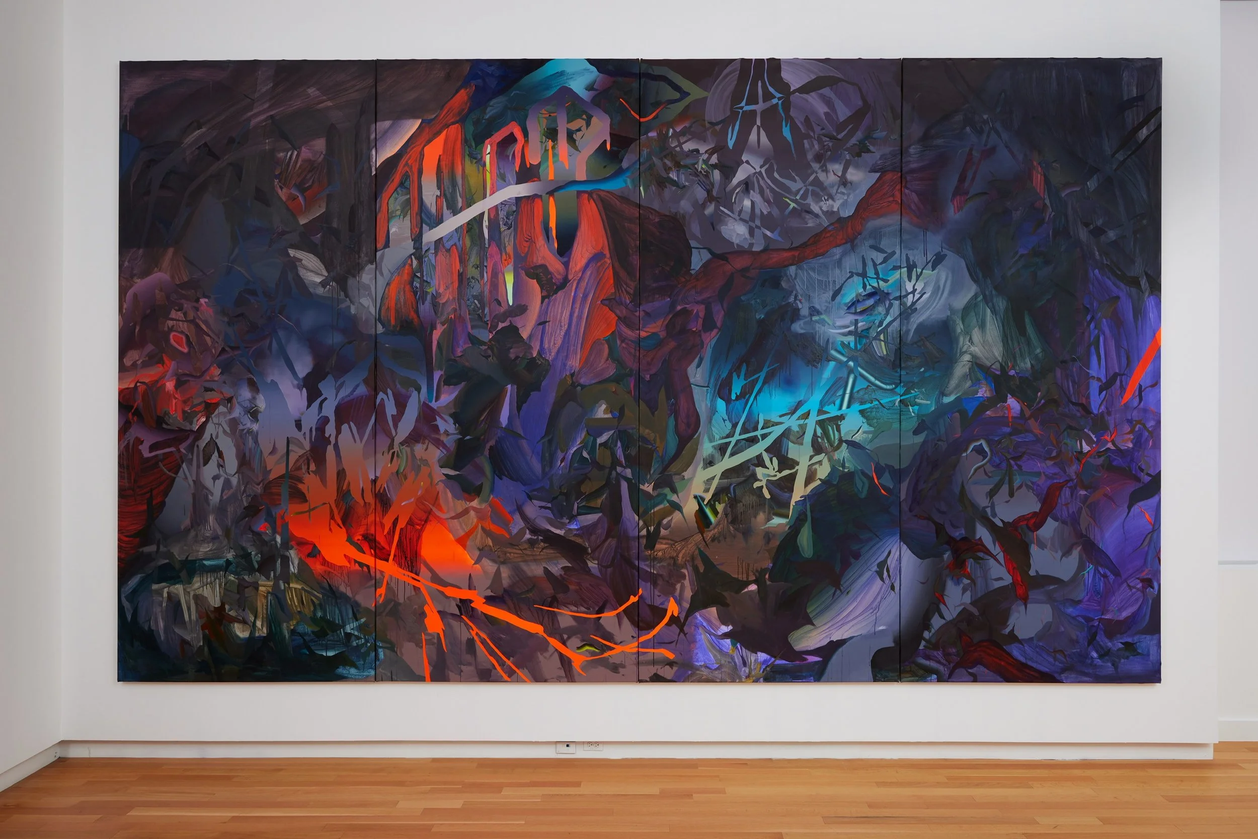
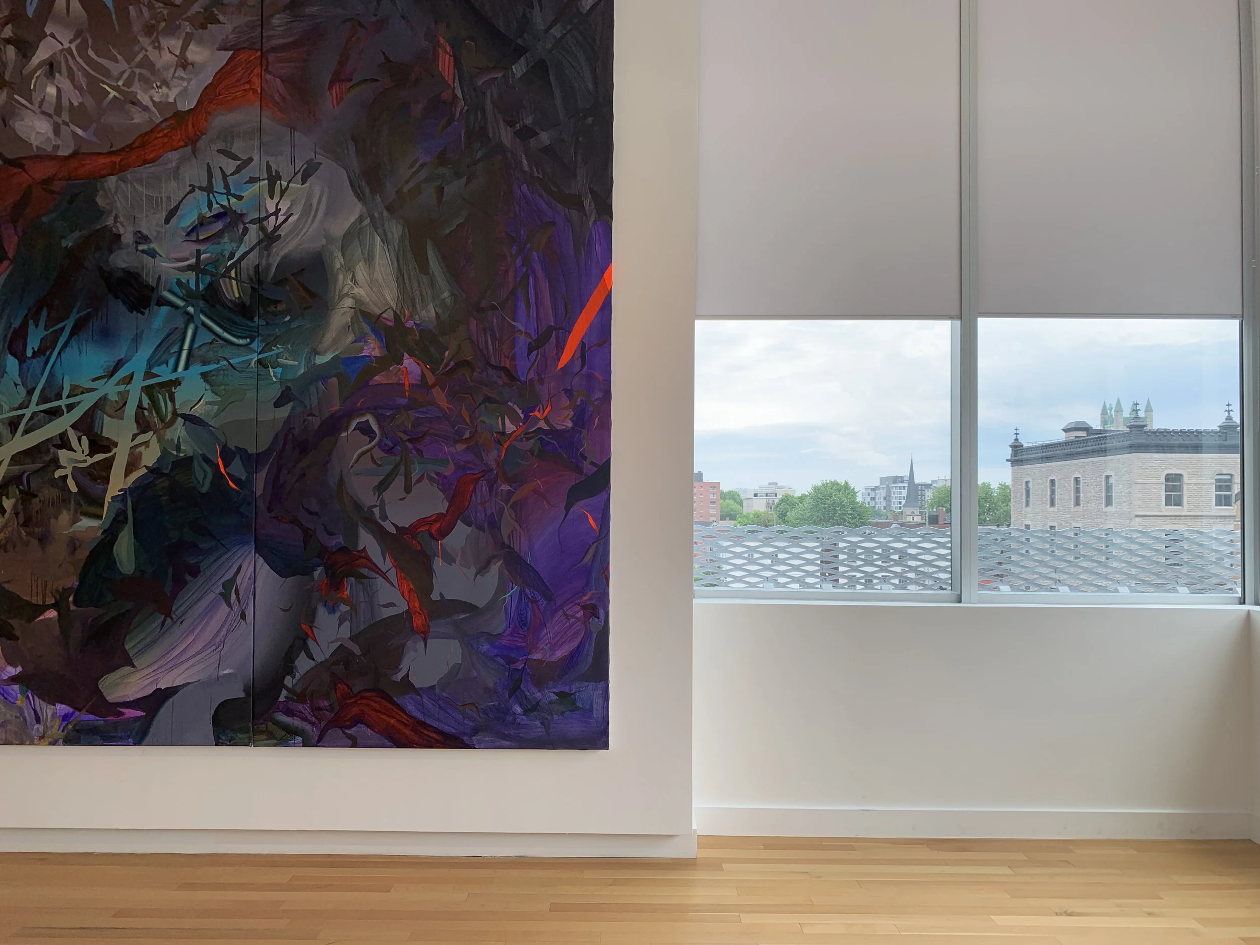
Tompkins, Sarah. Now the air is so filled with ghosts / that no one knows how to escape them, 2023, mixed media on canvas. Photo: Olivia Musselwhite.
Stepping out of the nautilus, a monumental painting glows from the doorframe of its exhibition space. Sarah Tompkins’ Now the air is so filled with ghosts / that no one knows how to escape them (2023) takes up its gallery wall. From the windows on the right, the light that streams in intensifies lava-like streaks splashing against blues and purples.
Tompkins, Sarah. Now the air is so filled with ghosts / that no one knows how to escape them, 2023, mixed media on canvas. Courtesy of the artist. Photo: Rémi Thériault.
The complex layering of seemingly organic forms were revealed to me when I sat with the work. Looking at the painting, the layers suggested to me the lingering effects of the passing of time which leaves physical marks.
The following conversation took place between Sarah Tompkins and I at the OAG’s Jackson café. We discussed in more detail her artistic practice and the collaborative aspects of the exhibition.
Olivia Musselwhite: This show interweaves three very different artistic practices that mesh together in a complex way under the theme of spanning the divide. How did this show come about?
Sarah Tompkins: Thematically the exhibition was tied together by the curators Rebecca Anne Rama and Karen Miller. We [the artists] all worked independently on our own practices but we did notice from very early on in the first year of the program that there was thematic overlap for all of us. So if we’re looking at someone like Kelly, she’s talking about what is home, essentially, and for her what does it mean to always be physically moving— leaving your home and having to create a new one to the point where you become disconnected from that initial idea of home. So I think for her the nautilus shell, and it being this reimaging or metaphor for the home that she created for herself, it's much more about an interior world than a physical place.
Rendek, Kelly. The Practice of Home, 2023, aluminum rounds and tubes, 3D-printed PLA, acrylic and oil on canvas, acrylic on spun polypropylene. Photo: Olivia Musselwhite.
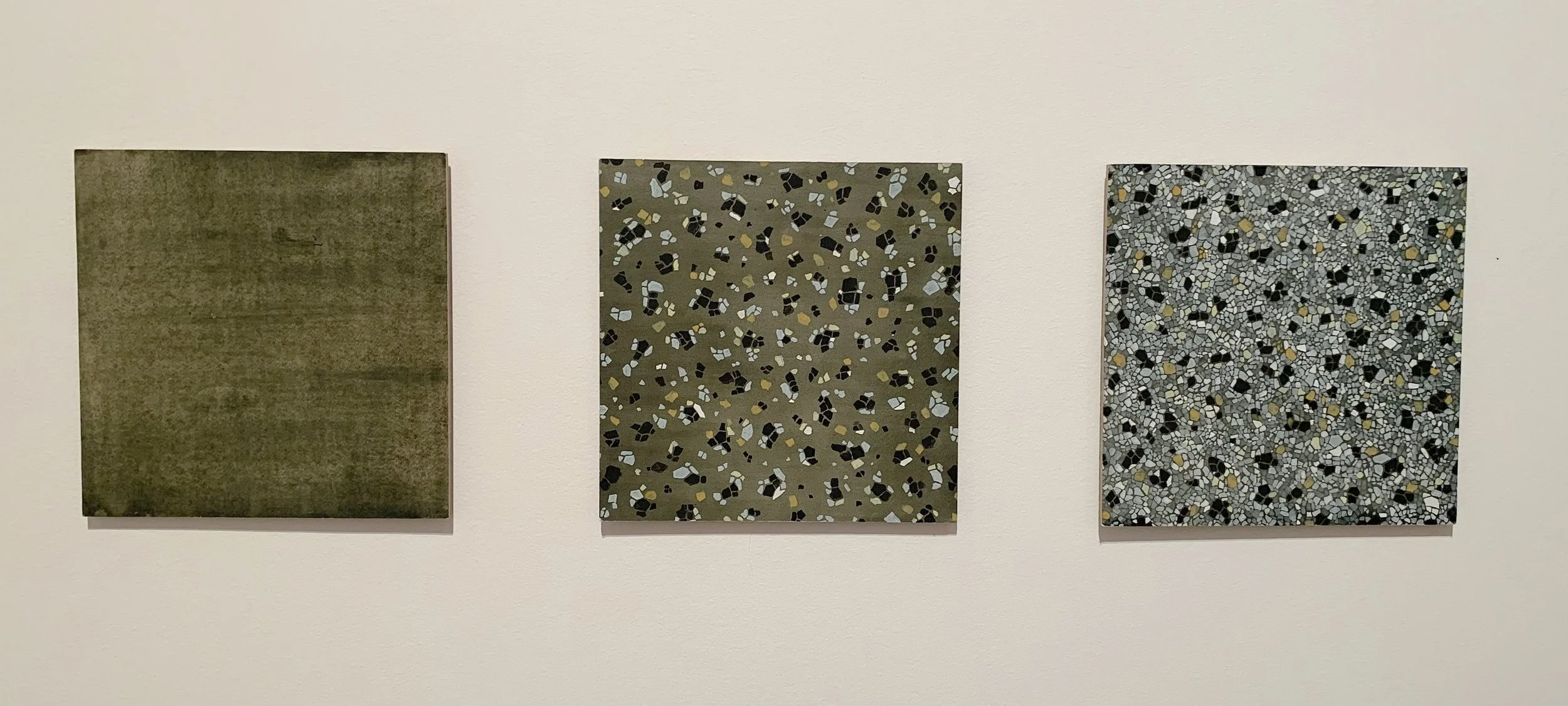
Then with Heer—we’re already dealing with a divergence of place and self—[her] terrazzo tile paintings [Getting to know you… (triptych)] she started making when she first arrived in Canada from India as an international student. And so, there’s three paintings and they accumulate more detail of the floor as you go along. For her, there’s a disorientation of being in a new place that you don’t really recognize, it's a huge culture shock, and she’s trying to piece together what it means to be there.
Mandaliya, Heer. Getting to know you… (triptych), 2021, Acrylic on hardboard and paper. Photo: Olivia Musselwhite.
I think that of the three, mine was a little more divergent from the clear relationship with home that Kelly and Heer had. For me, it was more about an interior sense of knowing. At least initially, it wasn’t about home as we think of it, as a place where you are most comfortable. For me that home idea came in through the studio itself. [In the MFA program] that was the first studio where I could close the door, where I'm not sharing air space with anybody, I can just go in and close it and work privately. I think there was this wanting to take full advantage of the opportunity. To be able to not function as a partner, daughter, sister, teacher. It was more about using my relationship with this space to find a connection for my own sense of truth through painting.
OM: I like the idea of the studio as a home.
ST: It was a psychic, spiritual, emotional space. It started with the physical practicalities of having a dedicated space, but the questions I was answering had much more to do with the possibilities that opened up as a result. It was six months of painting proper but eight months from conception to realization. And I was like, okay, I’m a little bit unavailable for anything other than painting for this period of time. That aspect was unfamiliar and a little uncomfortable for a while.
OM: Did you feel like you settled into the painting with time?
ST: Yes, oh yeah. Like, I’m here [in the studio], and when I’m done life kicks back in [but] I had a little window of time where I can justify just being there and focusing on [the painting], giving all the energy that I might put outwards just to this one thing.
OM: That’s so great. The exhibit label mentions briefly that the work was initially tacked to the entirety of your studio wall?
ST: [The painting] was deeply site specific. Right up to the ceiling, into the corners, and over the floorboards. I recently learned that it ended up being the largest painting that’s ever been done in the master’s program.
OM: Wow!
ST: Yeah, and so I think that there was this… wanting to feel my own interiority in order to develop a trust in intuition. How can I make it so big that even I can’t get away from it, that I have no choice but to rely on my gut?
OM: Because the site-specificity is so important, why is the painting on stretchers in the gallery? Was this for the protection of the art or a pre-planned choice?
ST: Oh yeah that was always the plan. Basically, when I first came up with the idea I was trying to source a twelve by twenty-four foot single piece of canvas. Logistically speaking, where am I going to get it? I couldn’t find anyone who was going to sell that to me at a cost I could afford. Also, where was I going to store it? Even if I roll it up I don’t have twelve feet anywhere to safely store this. The solution was to divide it into sections that were five feet wide, so the plan was to always have it stretched.
OM: I was also wondering if you could elaborate on the collaborative aspects of the show. You must have known each other already in the program. Did you chat about how the exhibition was coming together?
ST: We did. Karen and Rebecca did such a fantastic job. They grabbed the bull by the horns. We [the artists] reviewed our own exhibition texts and made a few edits. We had discussions about who would go in which space. We [also] spent hours talking over colour. In terms of collaboration this happened more so with the curators who were responsive to feedback and suggestions. In my case, there was talk of keeping some of the studio ephemera in the show. Meaning like bringing in my couch, rug, my coffee table set up, shelves with my books, paint supplies, and brushes and things, making a representation of my studio in the gallery. It got nixed in the end because I wanted people to focus on the painting and not be distracted by everything else, or look for “clues” to the painting in other objects.
OM: That makes sense. The painting has a commanding presence on its own.
ST: Thank you! I feel like the little white couch [in the gallery space] was enough. That you could come in and sit. It reflects my own relationship with the work—half the time that I spent with it [the painting], was just reading on the couch and glancing up at it to see if some risky move or solution would rise up.
OM: I also sat on the little white couch! In the work you use so much layering you can see the passing of time on the surface. You can see it. So all this layering, all this time. I’m sitting down and it’s like the painting is showing time but also demanding my time.
ST: Ohh that’s really great!
OM: Yours is the only work that I thought, “I need to sit down there’s so much!”
[Laughter].
ST: Well I think with both Kelly and Heer, the invitation is to move through the space.
OM: It is! I was doing that instinctively.
ST: Yeah, even the way that you walk in and want to immediately walk through Kelly’s nautilus shell [The Practice of Home (2023)]. Once you’re in her space you want to go through the spiral and around the side. Everything is an invitation to move.
Photo: Olivia Musselwhite.
OM: Something I wanted to discuss more is the use of light and movement. For Heer’s The Boundaries Are Now Crossed (2023) you move around cardboard waves and the shadows change as you go. In Kelly’s ‘The Practice of Home (2023),’ light comes through streamers and changes as you walk through. And your work, it glows! From outside the door frame of the room it's in, it’s glowing at you! So, all this light. Was this purposeful? Or was this more of a natural consequence of the artworks?
ST: First of all, I think it's interesting that you picked up on light as being an important factor for all our works. The studio where I worked on it had one north facing window and I worked under basically spotlights and fluorescents the entire time. Sometime in May, a little way into the painting, the window was more or less blocked by scaffolding…and so access to daylight I didn’t really have.
Photo: Olivia Musselwhite.
In terms of the way that it's shining [referencing the glow of the painting caused by the bright room it's displayed in] I actually really liked having the big window space [in the gallery] because it felt like a bit of a gift to the painting. You’ve been in this dark studio space the whole time you’re being made and then immediately being rolled up and then going to my new studio with no window. This is your first time seeing real daylight! Enjoy it!
OM: That’s so great!
ST: But because of the lack of daylight, it ended up being a night painting. I worked on it at night and I think that came through in the actual color relationships in the work. It’s very dark. That orange glow that you’re seeing, and those areas of radiant space, I’m thinking of those in terms of atmosphere and how light refracts at different times of day to create a different sense of space. If you look through my photo references—I don’t really have many, I tend to work from gut instinct— but the few I put aside are predominantly different times of day and light qualities.
OM: I was very curious about your work ending up being displayed in the room where one wall is taken entirely up by a window.
ST: In the end, Rebecca Basciano [Chief Curator at the Ottawa Art Gallery] came to do a studio visit in the painting’s earlier stages and she asked where I would like it to be. [The room the painting ended up being in] more closely references the size of the studio. So I figured if it was going to be in the massive space it would lose that sense of intimacy and wouldn’t have the same feeling of wanting to back up but not being able to.
OM: Well I was trying to take photos of the exhibition and I was doing exactly that!
[Laughter]
The placement in the exhibition makes a lot of sense. You were making the work in your studio that had a door and then that’s mimicked with the doorframe that closes off the painting’s room in the gallery.
ST: In the end I thought it was the right place to put it. The three of us [artists] got along really well and we all understood each other’s work well enough to make decisions that worked for all of us.
Within Spanning the Divide, past, present, and future mingle together, creating both a sense of familiarity and of newfound experience. Together, the works of Mandaliya, Rendek, and Tompkins create a compelling and nuanced representation of the complexities of places and their meanings.
Find the artists on Instagram or on their websites:
Sarah Tompkins
Heer Mandaliya
Kelly Rendek
